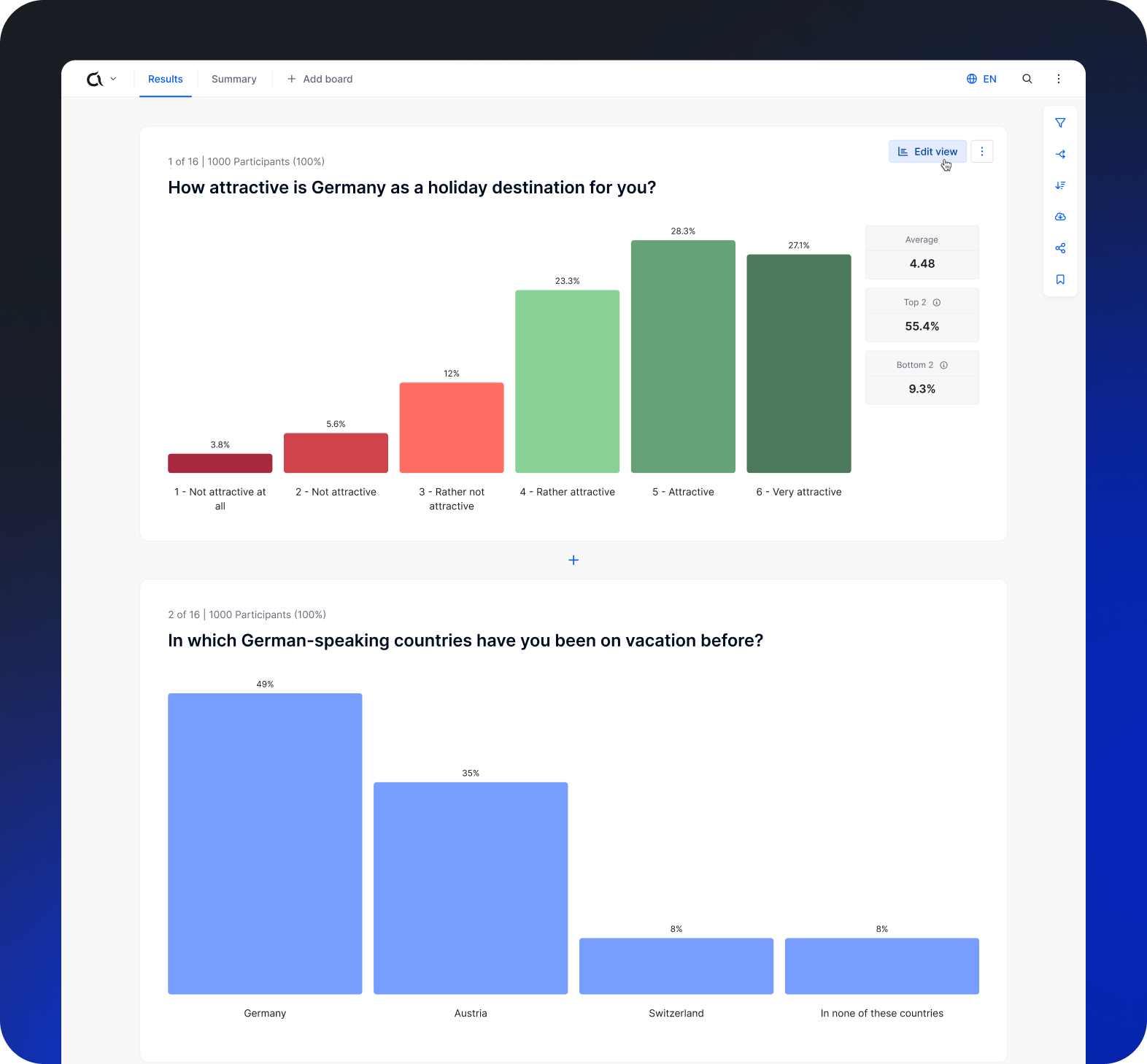
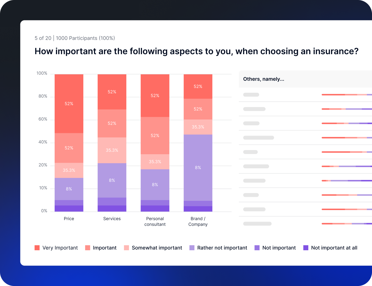
Appinio data visualization color system
Making data both beautiful and clear
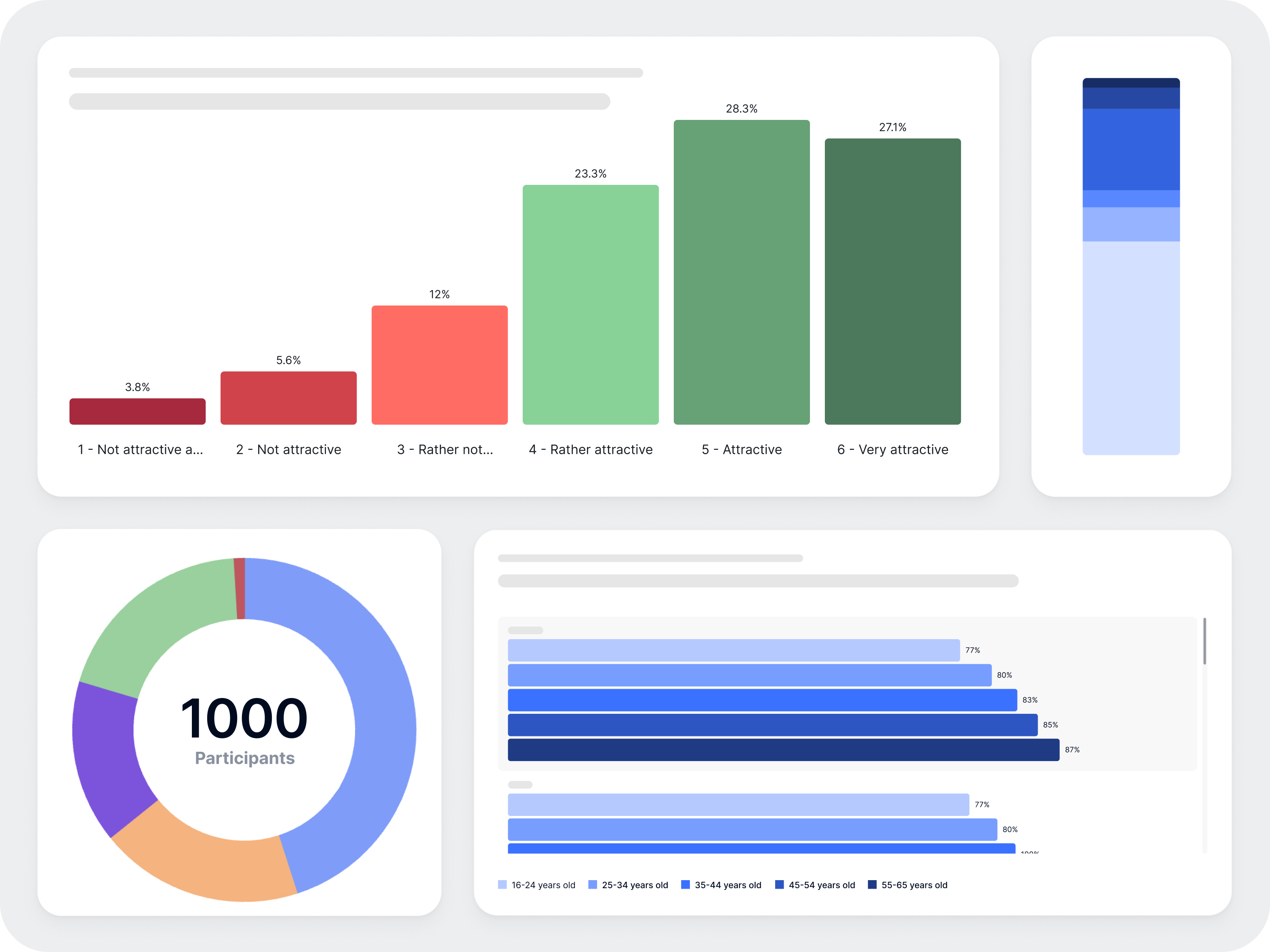
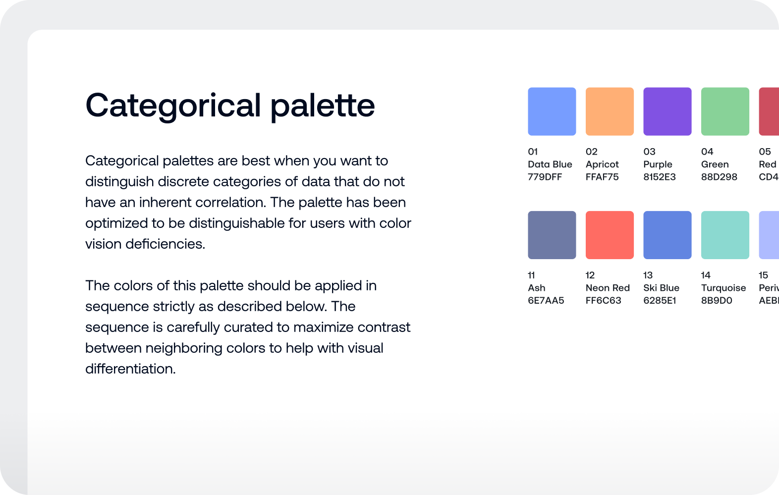
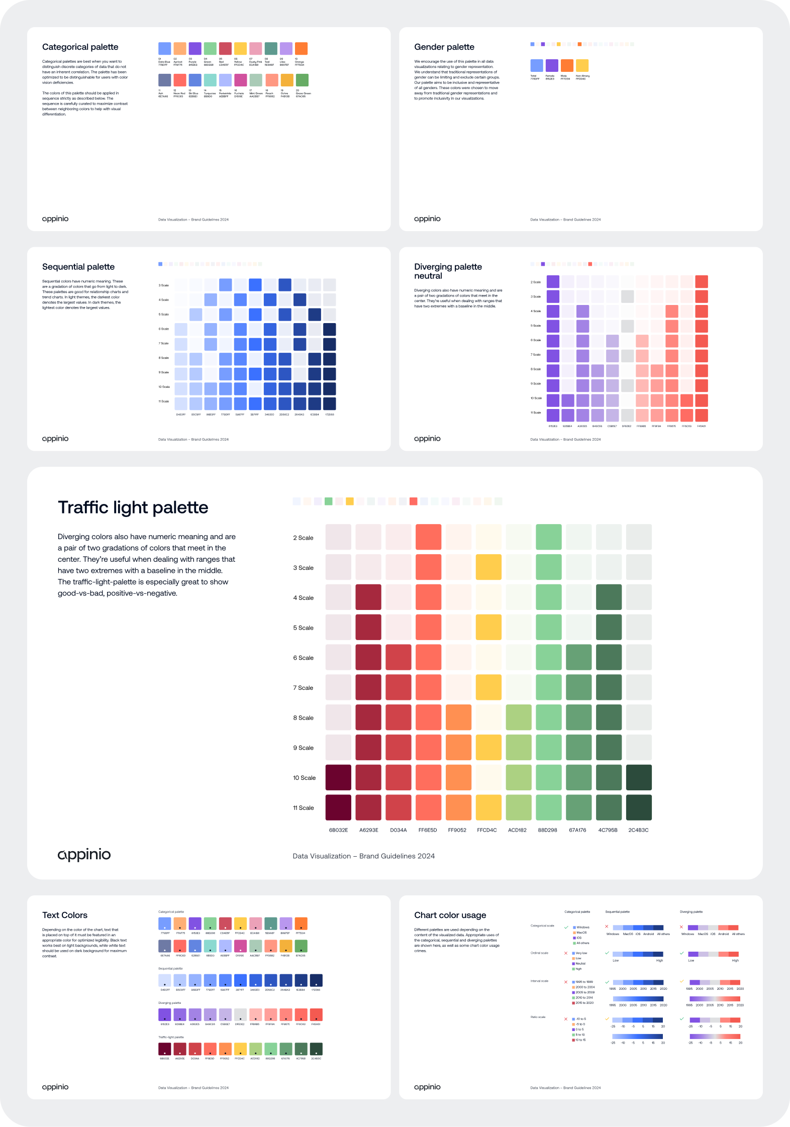
Data can be dry, complicated and difficult to decipher – Not at Appinio, where data is the key to uncovering insights that drive real impact. To ensure those insights shine, I was tasked with creating a color system that transforms how data is experienced. The result? Color palettes that balance beauty with clarity, making data not only look good but intuitive to understand. Now they make Appinio's data visualizations as vibrant as the insights they reveal.
